Oh my gosh, you guys, I totally love the way this week’s card turned out! I think it is so pretty. I’m glad that my last card for my “never-used stamp” challenge is my favorite from the whole month.
The stamps I used this week are special to me. I got them from a little Amish scrapbook/stamp/gift shop in Indiana while on vacation with my parents this summer. We had a bit of trouble finding the place, which was on a list of a bunch of little home-owned and operated Amish shops in this one town (the name of which is escaping me at the moment as we were in several communities all in one area). They also raised and sold canaries in that shop, so the whole room was full of sweet chirping from the birds, who were nesting at the time so we didn’t really get to see them very well, just hear them. I could have easily spent an hour in that store just browsing and looking at all the stamps and other fun things. But I picked only two stamps, as well as some other unique papers, and resisted spending my entire vacation budget at that one store. I used both stamps on my card this week.

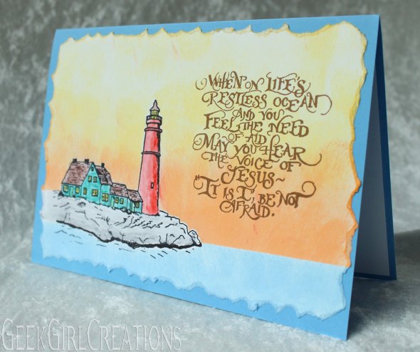
I stamped the lighthouse first and colored it with watercolor pencils. Then I used the masking technique where you stamp the image you want to protect on a piece of scratch paper, cut it out, and place it over the image on the cardstock. Then you can add color around and on top of the mask, which protects the image on the card but lets you get the color precisely around it. I used a sponge to stamp down the orange and yellow sky and the blue water, which kind of gives a watercolor effect as well. It was kind of tedious, but turned out so pretty. I finished it off with the sentiment stamp in a brown ink since I thought black would be a bit too harsh.
I didn’t want a really crisp edge, so I just tore the cardstock to give a more rustic look. I think it kind of looks like choppy ocean waves, so that fits the theme nicely.
I’d like to do another card with the same stamps but use darker colors, making the sky look more like storm clouds and put the sentiment in a lighter ink over the top. I think that would fit the message of the sentiment a bit more, but for my first time using the stamps I decided to go with a pretty sunset color scheme instead.
And that does it for September! I know I should probably start working on Christmas cards, but my list of people I send cards to keeps dwindling every year, plus I still have a couple left over from last year that I never sent, so I’m going to do one more month of a new challenge before I start working on Christmas cards in November. I’ve had October’s challenge in mind for several months and am really looking forward to it, so we’re putting off Christmas prep for another month. Check back next week to find out what October’s challenge is!

very nice!
LikeLike